6 Form Fixes to Make Before You Add Anything Else
March 31, 2026
Have a project in mind?
Get Started


✓ Fewer fields — keep only what matters
✓ A simple layout — make the next step obvious
✓ Clear instructions — help users complete it with confidence
✓ Trust cues — explain why sensitive details are needed
✓ Smooth validation — make errors easy to fix
✓ Less repetition — do not ask for the same information twice
Your landing page might look sleek and load in a flash—but if your form isn’t pulling its weight, you’re still leaving conversions on the table.
Forms are where interest turns into action. When they’re confusing, cluttered, or slow, that tiny bit of friction can quietly drain away leads you’ve already paid to attract.
In this article, we focus on 6 high impact form fixes to make first before you add extra fields, extra steps, more automation, or any other feature that increases complexity.
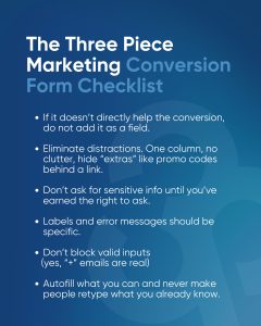
TL;DR – Quick checklist for high-converting forms:
Save the poster below and use it to cross check your existing / new form:
Before you add another field, take a look at what the data has been saying for years:
The takeaway: Strip your forms down to the absolute minimum.
For example, if there are fields that apply to certain users or scenarios (e.g., “apartment number”, “coupon code”) do not display those to all users. Displaying the relevant fields to users based on user input (e.g., “Add Address 2?”, “Do you have a promo code?”) helps declutter the experience for most users.
Those users who require the additional fields can still access them, while the majority are not delayed by non-relevant fields.
The way you design forms; how many items you include, and in what order; is far more important than simply deciding what information you want to collect.
Probably the biggest mistake is designing forms to fit a lot of fields horizontally across multiple columns or using a large, multi-section format. Such designs almost always do more harm than good.
Users read forms vertically from top to bottom; deviating from that vertical format will almost certainly confuse them.
Multi-column forms disrupt a user’s natural flow through the form, they are easily misunderstood and many times the user will skip over important fields. One possible exception would be a small grouping of related fields such as “City”, “State”, and “ZIP” entered on a single line. However, even those should be approached with caution and tested.
Multi-step forms can also be detrimental to conversions. Any time a user needs to click on another page or enter additional information, there is potential for them to abandon the form. Unless you have a lengthy form that is divided into logical sections with a clear indication of each step (progress bar), it is usually better to provide a single well-organised page.
If you need to create multi-step forms (for example a multi-page sign-up or checkout) group related questions logically and let the user know what to expect ahead of time.
Providing clear section headers or a progress bar can help to establish user expectation and alleviate anxiety regarding how much longer the form will take. The ultimate goal of removing distractions is to make sure users understand the path to completing the form. Make sure to keep the user oriented by providing only one path to follow.
There is another, often overlooked, item to remove: distractions surrounding the form. If your landing page or form page contains a cluttered header, a sidebar, or secondary calls to action, you may want to strip the unnecessary content to create a clean conversion-focused environment.
Many successful landing pages completely remove top navigation and secondary calls to action during the form process to focus the user’s attention solely on completing the form.
Nothing kills momentum like a confusing or intrusive form field. You’ve probably felt it yourself: you’re ready to sign up or check out, then a question appears that feels nosy or unclear and suddenly you’re not so sure you want to continue.
Even after you’ve removed unnecessary fields, some questions will still feel sensitive or unfamiliar. That’s where clear language and a human tone make all the difference. Any time a field might give someone pause, add a short explanation of why you’re asking and how their information will be used.
Phone numbers are a classic example. Many people assume that if they hand over their numbers, they’ll start getting marketing calls. A single line of microcopy “We’ll only use this to arrange delivery. We won’t spam you or share your number.” can ease fear and increase completion. Simple “Why do we ask this” links do the same job, giving users a quick, low-pressure way to get context.
Labels and help text should sound like something you’d say to a real person, not like a database field name. Skip the jargon and internal codes. Instead of “RRN Code,” say “Referral code (if you have one).” Instead of “Address 2,” say “Apartment or suite (optional).” Clear, descriptive labels reduce the mental effort required to fill out the form and keep people moving forward. Every time users have to stop and figure out what belongs in a field, their cognitive load goes up, and the odds of them abandoning the form go up with it.
Another common pain point is knowing which fields are required. The exact pattern you choose matters less than being consistent. One option is to mark optional fields explicitly and treat everything else as required, which keeps the form visually clean. Another is to highlight required fields (often with an asterisk), a pattern many usability experts favor because it makes the “must-fill” questions unmistakable.
Both approaches can work well; the real mistake is doing nothing and leaving people to guess, only to hit an error after they click Submit.
The goal is simple: remove uncertainty. Make it obvious what you’re asking for, why you need it, and which fields are required, so users feel informed, respected, and confident about finishing the form.
If that conversation feels one-sided, demanding information without acknowledging comfort or trust, people will hesitate, stall, or abandon the process entirely.
To get more users to complete your form, strip out anything that feels invasive or pushy. A classic example is forcing account creation at the very start of checkout or sign-up. When users are asked to “Create an account” before they’ve even completed their purchase, many feel trapped or distracted from their original goal.
That’s why so many large sites now default to “Checkout as guest” and only introduce account creation after the purchase is complete or as a clearly secondary option. By removing that early barrier, they reduce cart abandonment and let users focus on finishing what they came to do.
Before you ask for sensitive details like phone numbers, ID numbers, or other personally identifiable information, pause and question whether it’s truly necessary at this stage. Users are increasingly protective of their data. If a form asks for too much, too soon, without first earning credibility, many will simply back out.
You can build that credibility with clear trust signals and transparency. Include a brief privacy statement or link to your policy, display recognisable security badges where appropriate, explain which fields are required versus optional, and tell users how their data will be used in plain language as discussed in point 3.
Optimising forms can backfire when your validation rules are too tight or fussy. What feels “careful” on your side can feel petty and annoying on the user’s side.
Walk through your form like a real customer. Type fast. Make a few mistakes. Notice where the form snaps at you or blocks what feels like perfectly normal input.
That frustration often comes from rules that are stricter than they need to be. Baymard Institute, for example, highlighted a checkout form that wouldn’t accept email addresses with a plus sign (+), even though many people use aliases like name+newsletter@example.com. In trying to be precise, the site ended up blocking perfectly valid customers.
The same thing happens with the way we word our error messages. Instead of a blunt “Error: Password unacceptable,” say something like “Try a longer password with a mix of letters, numbers, and symbols.” This is a much friendlier tone.
For things like phone numbers, let people type the way they naturally do: spaces, dashes, country codes. You can clean it up behind the scenes. Forcing one exact format doesn’t make their life easier; it makes them feel like they’ve done something wrong.
And once they feel that way, they’re only a step away from giving up. Every time someone hits a brick‑wall error, their patience shrinks. Ideally, most users should never see an error at all. But when they do, keep it simple and close to the field: a short message that says what went wrong and how to fix it in one step.
And if your form still has a “Reset” or “Clear form” button, it’s time to retire it. People click these by accident, wipe everything they’ve entered, and often give up altogether. Your form really only needs one big action: the one that moves them forward.
Few things make a form feel more frustrating than being asked to repeat information the business already has. If someone has already entered their name, email, address, or preferences, asking for the same details again creates unnecessary friction and makes the experience feel clunky. It slows people down and signals that the process isn’t well designed.
This shows up most often in multi‑step forms, checkout flows, booking systems, and lead‑gen funnels.
Good form design actively looks for ways to avoid this. Autofill, pre‑population, and carrying information forward from earlier steps should be the default. If a user is logged in, known details should already be filled in. If they’ve made a choice on a previous screen, the next step should reflect it instead of asking them to restate it. When billing and shipping details are usually the same, a simple checkbox is better than forcing people to type everything twice.
Ultimately, this is about respecting attention. When a form feels efficient and considerate of a user’s time, they’re far more likely to complete it.
Forms sit at the very end of your funnel, where a tiny bit of friction can cost you a lead or a sale.
The most reliable way to improve performance isn’t adding clever widgets; it’s removing what gets in the way. Like pruning a tree, cutting back what’s unnecessary gives the important parts room to do their job.
You’ll see the impact in the numbers: higher completion rates, fewer abandoned checkouts, and more users reaching the finish line without frustration.
If you’d like an outside perspective, Three Piece Marketing can help. We can highlight quick wins and deeper improvements, then help you design forms that are lean, clear, and built to convert.
Contact us (link to page) and let’s turn your forms into a quiet, effective engine for growth.
Sephora
Ready to engage your customer base and compel them to engage?