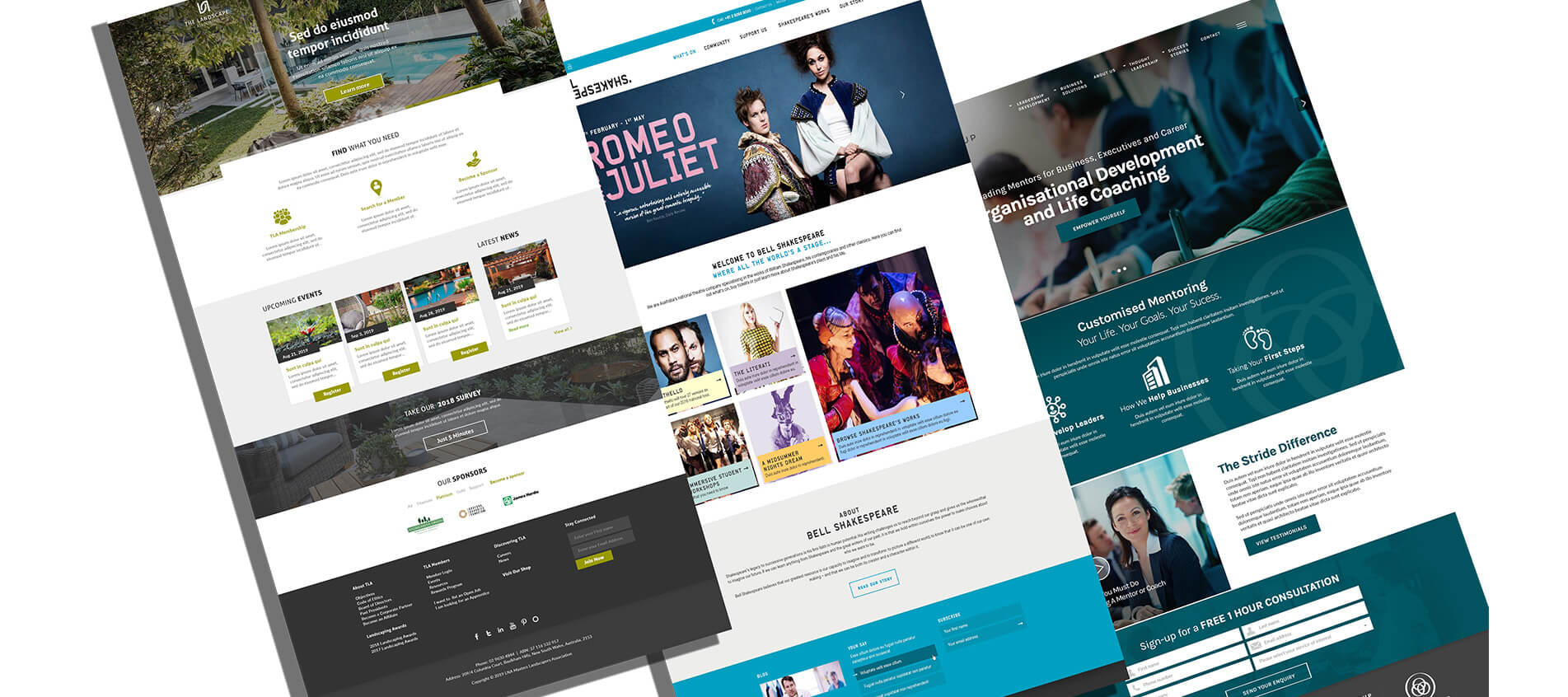
The power of landing pages and good User Experience
May 16, 2021
Have a project in mind?
Get Started
Whether you use your online presence as a proof point to reinforce sales, or use it as your primary sales vehicle, if the last year has shown us anything, it is that your presence has to be Schmick. With more and more people working from home, the decisions they may have once gone to others to help make, or the resources they had access to are gone, meaning they rely more on what they can find online themselves. This is where you, therefore, need to excel. In the development of pages that fast track the process for users in a way that truly adds value.
We are talking about product and service pages that enable users and landing pages which help drive conversion from other mediums. In simple terms, an effective and successful landing page will convey streamlined information that encourages users to convert. They need to be relevant, add value, remove complex decisions and thus be easy to utilise. The objective is for visitors to rapidly comprehend what’s being offered and why it should make a difference to them, then take the intended action.
Depending on what you are trying to sell, or how far down the sales process a visitor is, conversion can mean different things, which may include online purchases, account openings, credit applications, downloading a paper, clicks to call and form submissions.
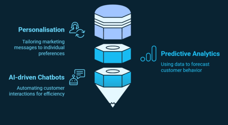
If the current mood of the room persists, then people will be researching, shopping and conversing online in increasing numbers. The upshot of this is that UX will remain a significant component of the sales process as companies seek to satisfy their would-be user’s needs. Sites will need to be better designed, streamline processes and add value even more than before. The key is to provide positive experiences that keep users loyal to your products or brand. Furthermore, a significant and meaningful user experience permits you to define customer journeys on your site that are generally helpful for business success.
Let’s start with a statistic – intentional and strategic UX has the potential to increase conversion rates by as much as 400%. If your goal is to grow any part of your business, then best practice here is going to be important. That said, the main thing to remember when designing web and user interfaces is that you are not your users and not assume to understand what they need or what they need. What we are saying is this: It doesn’t matter how beautifully designed your website is if despite their best efforts, visitors can’t figure out how to use its features or aren’t driven to a goal.
So, what then does characterise great experience? You can ask directly if you have the time, budget and inclination, you could observe them, or you can do tests with different versions to see what does convert. Irrespective of what method you use, your mantra should be, ‘Listen, observe and question.’
That is the theory of UX, but in practice, it is about ensuring you have a solid user interface. You need to ensure your landing page is easy to navigate, your message conveys your value for them, that the Calls to Action (CTA) are prominent but not dominating, and next steps are not confusing.
After all, what use is it in undertaking lead generation activities if the page someone gets to does not reinforce the message you sold them to bring them here. Our Founder Hamish uses this analogy:
Someone enters your store after seeing a pair of shoes in the window they love and asks you for a size 8. You now have two options. Do you tell them to go look for them out the back themselves, or do you do get the shoes for them and help them try them on?
If you are making people do extra work, then there is every chance they will go elsewhere where the process is simple. So make it simple for them. Build product and landing pages that work. Here are some tips on how to build them effectively.
The essential objective of your landing page ought to be to make it as simple as feasible for a visitor to convert, so, ensure that all components of your page synchronise towards the conversion objective, regardless of whether it is filling out a form, making a purchase, signing up for a newsletter, or downloading an e-book.
Intelligent use of colour and eye-catching images are the hallmarks of an effective landing page design. Whilst studies show that specific button colours, for example, red or green, may increase landing page conversions, ensure that what you do ties in with your overall site colour scheme. IF you are unsure if your button is driving conversion, try A/B testing and see if colour, positioning, and size affect the effectiveness of your landing page layout and design.
A landing page should have one purpose – to drive engagement. Ensure this by keeping your page focussed on the thing you want a customer to do. Limit navigation options, remove pop-ups and reduce questions. In other words, make your landing page do nothing but convey the fundamental information needed to urge guests to convert.
Consider what key information should appear above the fold within the visitors’ direct line of vision and what can be put underneath the fold. If you know your audience are on a mobile more often than not when viewing your site, design with mobile first intentions and ensure that the intel people need on that device is found easily.
When you design your site, irrespective of the page (product page, contact page or landing page) ensure that someone knows immediately what the offer or purpose of that page is in clear and succinct terms. The landing page headline and subheadings give you a vital way to promote the value of your offer. Most effective landing pages attract potential customers with smart, contextual headlines and utilise the sub-heading for additional points and value proposition.
Good landing pages utilise trust signals, which can indicate to guests that their offer and brand are reliable and trustworthy. Trust signals can take various forms –testimonials are an exemplary type of trust signal, capitalising on word-of-mouth to guarantee new visitors with support from past clients or customers. Using platforms such as ShopperApproved which pulls in real and qualified user reviews can add immense value to your social proof and help convince other visitors. Similarly, “Like” counters indicate endorsement through “Likes” and +1s from various social media sites and should be included if useful.
As stated above, consider your audience and where they are coming from. In the first quarter of 2021, Statista found “…mobile devices (excluding tablets) generated 54.8 percent of global website traffic”, so if you are not designing with this in mind, you are designing for failure.
As you may be identifying by now, less is more when it comes to developing a strong landing page. Under this philosophy, your form should capture only what is critical and nothing more. The more fields you request, the greater the probability you will lose people along the way. Only ask the essentials when your conversion requires a form and keep in mind; you can always request more information on the thank you page.
Most users do not mind giving their name and email address, but requesting telephone numbers or even birthdates can make your drop-off rate skyrocket to 50 percent, so you need to be careful with those form fields.
If you have an incredible offer and have been promoting it well, you’ll probably attract traffic from various sources (Facebook, Google, A newsletter, social media). You can improve your chances by customising your landing pages for these different audiences. For example, a person who arrives at your landing page from a PPC ad or a link from your monthly newsletter will be potentially different because the messages you convey in each are likely to be different, so consider having different pages for each audience or referral source.
When you launch your landing page, building in back-end efficiencies makes sense. We are talking about things like interfacing with your email marketing or marketing automation tools where the data passed from the form completion (or another designated trigger) triggers activity in the back-end platform. Ideally, when a contact submits your landing page form, their data synchronises to marketing automation software so that they move into a process that helps move them to the next stage of your buyer life cycle.
Test, test, and test again! You’ve heard this mantra before, and in this instance, A/B testing will be the guide you need to determine if you have a good landing page. The only way to assess your conversion funnel and marketing campaign is to get data directly from your customers’ behaviour; A/B testing allows you to do exactly that. You cannot create an effective landing page without a thorough amount of testing. Testing and tracking outcomes are fundamental for seeing what your landing page is doing right and what it is doing wrong.
At the end of the day, designing a page (let a lone a whole site) requires forethought, investigation and trial. If you need help with any of the above, let’s have a chat.
The 3PM Team
Strategy
Tips
Ready to engage your customer base and compel them to engage?